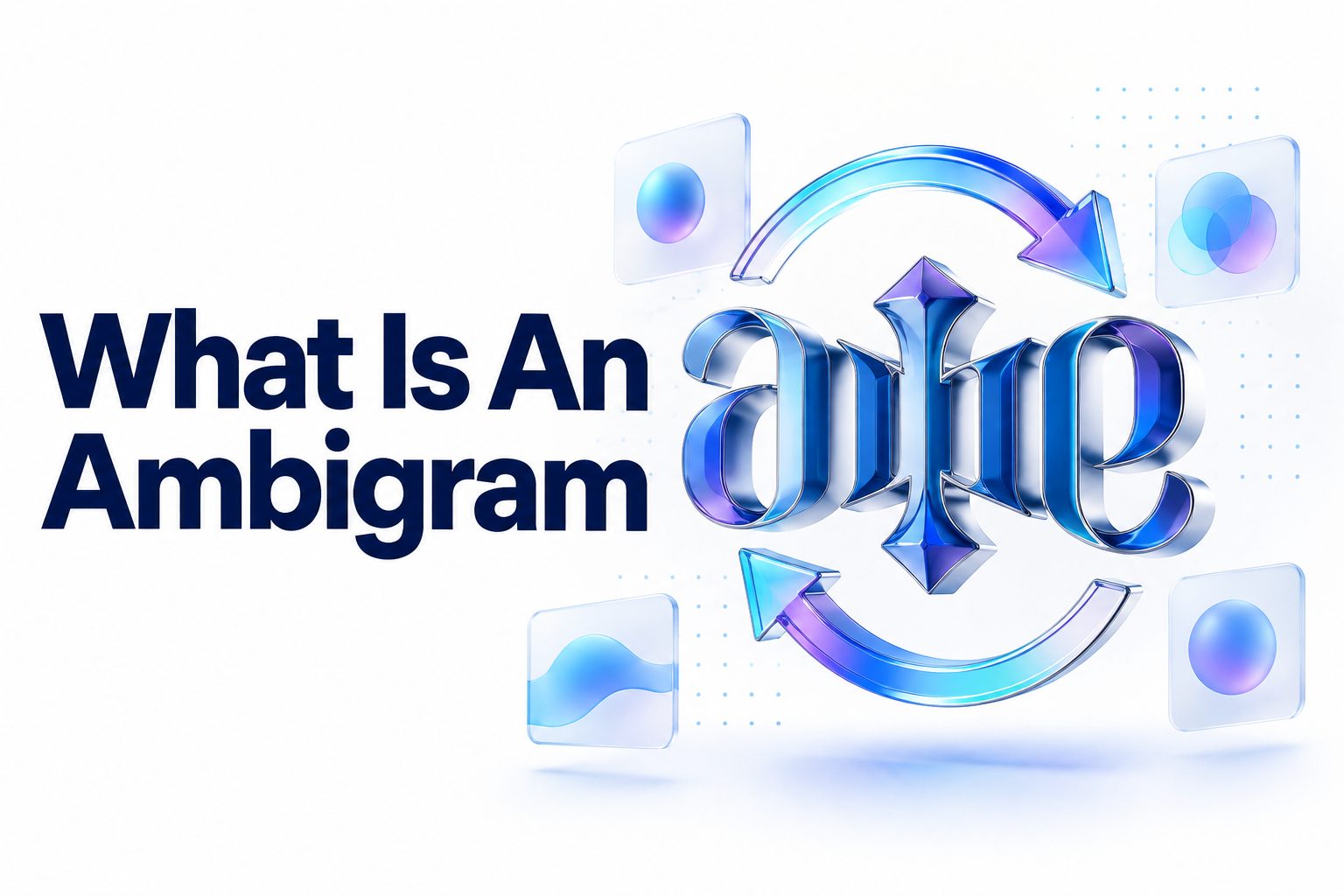
An ambigram is a word, name, or symbol designed to remain readable when viewed from another direction, orientation, or perspective. The best-known examples can be rotated 180 degrees and still display the same word, although some reveal a different word after rotation. Other ambigrams rely on mirrors, reflections, or shifts in visual perception.
So, what is an ambigram in practical terms? It is a piece of lettering that performs more than one reading without simply printing the text twice. The artist reshapes individual letters, adjusts spacing, and uses shared strokes so the design works in each intended view. The result sits somewhere between typography, illustration, calligraphy, and optical illusion.
This article explains how ambigrams work, the major types you may encounter, and why certain words are easier to transform than others. You will also learn how to design a simple rotational ambigram, recognize common mistakes, choose suitable tools, and evaluate whether a finished design remains readable. By the end, you should be able to identify an authentic ambigram and begin planning one of your own.
What Makes a Design an Ambigram
An ambigram must support at least two meaningful readings through a planned visual transformation. That transformation might involve rotation, reflection, inversion, or a change in perception. The lettering is deliberately constructed so its lines and shapes perform different roles depending on how the viewer sees it.
A decorative word is not automatically an ambigram. Neither is ordinary text placed beside an upside-down duplicate. The transformation should be built into the letterforms themselves. In a successful design, the viewer sees one unified image rather than two separate versions awkwardly joined together.
Readability is important, but ambigrams rarely look as conventional as ordinary type. Some letters must be distorted to accommodate a second reading. The designer’s challenge is to make those distortions feel consistent enough that the eye accepts them as part of a coherent lettering style.
The Basic Principle Behind Ambigram Lettering
Most ambigrams work by pairing letters or letter groups. In a rotational design, the first letter may become the last letter after a half-turn, while the second becomes the second-to-last. Designers compare these pairs and create hybrid shapes that can represent both characters.
Consider a four-letter word arranged as A-B-C-D. After a 180-degree rotation, the reading order reverses. The designer therefore needs A to transform into D and B to transform into C. If the word maps onto itself successfully, it can be read before and after rotation.
Not every pairing has to involve a single letter. One wide character may transform into two narrow ones, or two connected letters may become a single character. This flexibility is called many-to-one or one-to-many mapping, and it can solve combinations that resist simple letter-for-letter treatment.
Important Facts About Ambigrams
- An ambigram may display the same word or a different word after transformation.
- Rotation is common, but reflection and perceptual shifts can also produce valid ambigrams.
- Letter shapes are usually customized rather than taken directly from a standard font.
- Readability often depends on context, spacing, and a consistent visual style.
- Capital letters, lowercase letters, scripts, and symbols can all be used.
- Short words are not always easier; compatible letter pairings matter more than length alone.
- A design can be technically correct yet unsuccessful if most viewers cannot read it.
Major Types of Ambigrams
The term ambigram covers several visual systems rather than one fixed technique. Rotational ambigrams receive the most attention because they work without a mirror or special viewing setup, but they are only one category. Each type uses a different transformation to create its secondary reading.
Knowing the categories makes it easier to describe what a design actually does. It also helps artists choose a workable approach. A difficult word may fail as a rotational design yet translate naturally into a mirror-image or figure-ground composition.
Rotational Ambigrams
A rotational ambigram changes when turned around a central point. The most familiar version uses a 180-degree rotation, sometimes called half-turn symmetry. The design can show the same word in both orientations or switch between two different words.
A 90-degree rotational ambigram is possible but considerably harder because the lettering must work vertically and horizontally. These designs often depend more heavily on geometric forms, compact symbols, or highly stylized characters than ordinary word-based ambigrams do.
Mirror Ambigrams
A mirror ambigram becomes readable in reflection. Some designs display the same word in the mirror, while others reveal a second word. The reflection may occur across a vertical axis, a horizontal axis, or another carefully selected line.
This type is useful for signage, installations, tattoos positioned near a mirror, and artwork involving physical reflection. A vertically mirrored design typically pairs the first and last letters, much like a rotational ambigram, but the letterforms flip rather than turn upside down.
Figure-Ground Ambigrams
A figure-ground ambigram uses positive and negative space to hold separate readings. One word may appear in the dark shapes, while another appears in the empty areas around or within them. The viewer’s attention determines which message becomes dominant.
These designs demand precise control of counters, gaps, and silhouettes. They can be striking in logos because the second reading rewards closer inspection. They are also easy to overcomplicate, especially when both words contain dense or irregular letterforms.
Symbiotograms
A symbiotogram is an ambigram that presents one word in its initial orientation and a different word after transformation. The two words are visually interconnected, even when their meanings contrast. Common conceptual pairings include love and hate, life and death, or dream and reality.
Because the words differ, the artist must solve both letter shape and spelling relationships. Words of unequal length may require grouped mappings, ligatures, or compressed strokes. A convincing result makes the change feel surprising without making either reading excessively obscure.
Chain and Repeating Ambigrams
A chain ambigram repeats letters or words in a continuous pattern. The design may be circular, linear, or tiled, with parts of one word also forming parts of the next. Some chain ambigrams can be read from more than one starting position.
This approach works well for borders, rings, bracelets, and decorative patterns. It reduces the importance of a single upright orientation, although joins must remain clear. Repetition can hide transitions, but it can also create visual clutter if every connection is equally heavy.
Ambigram Types Compared
Type | Transformation | Typical Result | Common Use
Rotational | Turned 180 or 90 degrees | Same or different word | Tattoos, logos, prints
Mirror | Viewed in reflection | Reflected reading | Signage, installations, artwork
Figure-ground | Attention shifts between filled and empty space | Two embedded readings | Logos, posters, visual puzzles
Symbiotogram | Rotation or reflection | A different word appears | Conceptual art, paired names
Chain | Repeated along a path | Continuous or multi-directional reading | Rings, borders, patterns
Perceptual | Viewer reinterprets the same marks | Alternate reading without movement | Optical art, experimental lettering
How Ambigram Letterforms Work
Ambigram artists do not treat letters as rigid shapes. They break them into structural parts: stems, curves, bowls, crossbars, terminals, counters, and diagonals. A stroke that forms the leg of one letter may become the arm or curve of another after transformation.
The human reading system is flexible enough to tolerate incomplete or unusual characters when surrounding letters provide context. Designers use this tolerance carefully. A questionable form may still read correctly inside a familiar word, but too many ambiguous letters in sequence will make the entire design collapse.
Stroke Sharing and Visual Economy
Stroke sharing allows one line to serve more than one purpose. A flourish beneath one character might become a crossbar after rotation. A large loop can form a lowercase “g” in one view and the curved shoulder of another letter in the second.
Efficient sharing generally produces cleaner ambigrams than adding separate marks for every feature. Extra strokes may solve one orientation while introducing noise in the other. The goal is not to preserve every detail of standard typography, but to retain enough distinctive cues for reliable recognition.
Letter Pairing and Mapping
In a same-word rotational ambigram, letters usually pair from the outside inward. For the word “MATH,” for example, the M must transform into H, while A must transform into T. Those structural relationships determine whether a simple solution is realistic.
Some pairs are naturally compatible because they share broad geometry. Others require custom calligraphic forms, decorative extensions, or grouped letters. A designer might turn one complex character into two smaller characters if direct pairing produces a shape that no longer resembles either intended letter.
Consistency and Style
Unusual letters look more believable when they follow one visual language. Matching stroke thickness, repeated angles, similar curves, and consistent terminals teach the viewer how to interpret the design. The style creates a set of internal rules, even when the forms differ from familiar typography.
Blackletter, script, and ornamental lettering are popular for ambigrams because their flourishes provide adaptable strokes. Clean geometric styles can also work, but they leave less room to conceal compromises. A related resource on [Internal Link: Typography Design Principles] can help clarify how weight, spacing, and contrast influence recognition.
Why Some Words Are Easier to Turn Into Ambigrams
A word’s suitability depends largely on the compatibility of its paired letters. Words with symmetrical structures or visually adaptable characters give the designer more options. Natural rotational relationships, repeated letters, and balanced word lengths can reduce the amount of distortion required.
Meaning also affects the design choice. A personal name may need immediate readability, while an art print can tolerate more visual mystery. For a tattoo or business logo, forcing an unsuitable word into a rotational format may be less effective than choosing a mirror or custom monogram approach.
Useful Letter Characteristics
- Rounded letters can often be reshaped into bowls, loops, or enclosed counters.
- Diagonal strokes provide flexible connections between distant parts of a design.
- Repeated characters help establish a consistent transformation rule.
- Ascenders and descenders can become flourishes or structural strokes after rotation.
- Familiar words allow readers to infer slightly unconventional characters from context.
- Pairs with radically different proportions may need multi-letter mapping.
- Very short words can be difficult because each ambiguous mark carries more weight.
A Practical Method for Creating a Rotational Ambigram
Start with pencil sketches rather than polished software. Early ambigram work depends on testing relationships, and rough drawing makes it easy to discard weak ideas. Your first objective is to solve the transformation, not to produce attractive finished lettering.
For this exercise, choose a word of four to eight letters. Write it normally, then write it beneath the first version in reverse order. This arrangement exposes the letter pairs that must share forms after a 180-degree turn.
1. Choose the Reading
Decide whether the ambigram will display the same word after rotation or change into a second word. Same-word designs are easier to plan because the spelling relationship is fixed. Two-word designs may require matching lengths or flexible grouped letter combinations.
Write the intended readings clearly before sketching. If the words have different lengths, mark possible groupings such as one letter becoming two. Do not begin decorating until you know which characters or groups must transform into one another.
2. Map the Letter Pairs
Place the first word above the second reading in reverse order. Draw lines between the characters that must share forms. For a same-word design, the outermost letters pair together, then the next inward pair, continuing toward the center.
Examine each combination for shared features. Look for curves that could become stems, diagonals that could reverse direction, and loops that might act as counters. At this stage, think in shapes rather than relying on existing font outlines.
3. Sketch One Pair at a Time
Draw the first character, rotate the page, and modify the shape until the paired character becomes visible. Repeat this process rather than trying to imagine both views perfectly. Physical rotation quickly exposes misplaced strokes and false assumptions.
Make several loose versions. One may emphasize readability in the first orientation, while another favors the rotated reading. A third sketch can combine the strongest features of both. Ambigram design usually improves through iteration rather than a single clever drawing.
4. Build the Center
Odd-length words have a central letter or group that must transform into itself. Characters with natural half-turn symmetry are helpful, but exact geometric symmetry is not mandatory. The center can be stylized as long as it remains plausible in both orientations.
Even-length words meet between two central characters. Pay close attention to spacing at this join. If the center becomes too dense, the word may look split into two unrelated halves or create an unintended extra character.
5. Establish a Consistent Style
Once the paired shapes work, redraw them with consistent stroke weight, slant, curvature, and terminal treatment. Repeat useful features across the word. A flourish introduced to solve one difficult pair can sometimes be echoed elsewhere to make it feel intentional.
Avoid decoration that exists only in one orientation. Every added line should either assist recognition, strengthen composition, or support the overall style. Decorative marks that become meaningless clutter after rotation weaken the design.
6. Test Both Orientations
Show the sketch to someone who has not seen the intended word. Ask what they read before providing clues, then rotate it and ask again. This test is more reliable than your own judgment because repeated exposure makes you aware of what the shapes are supposed to say.
Record the letters that cause hesitation. Revise those specific forms rather than redrawing the entire design. Also test the ambigram at a small size, since narrow gaps and delicate strokes may disappear when reduced.
7. Refine and Digitize
Trace the strongest sketch on clean paper or import it into vector drawing software. Use curves and anchor points to smooth the outlines without removing their handmade character. Keep an earlier version nearby so digital precision does not erase useful irregularities.
Print the design, rotate the printout, and inspect it away from the screen. Test it in the size and medium where it will appear. A form that works on a large monitor may fail when printed on a card or tattooed at a small scale.
Ambigram Design Checklist
□ Both intended readings can be identified without a long explanation.
□ The word still works after an exact 180-degree rotation.
□ Stroke weight and visual style remain consistent.
□ Spacing does not create accidental letters or word breaks.
□ Decorative marks contribute to both orientations.
□ The center feels balanced rather than crowded.
□ Small counters and gaps remain open at the final size.
□ Unfamiliar viewers can read the design in both directions.
□ The artwork suits its intended use, such as print, screen, logo, or tattoo.
Tools for Making Ambigrams
Paper remains one of the best tools for developing ambigrams. A pencil, eraser, tracing paper, and rotating surface make experimentation quick. Tracing paper is especially useful because it lets you rotate a sketch, overlay alternatives, and compare the two readings directly.
Digital tools become valuable during refinement. Vector software allows precise curve editing and produces scalable artwork for logos, engraving, and print. Raster drawing programs are suitable for painterly or textured lettering, but high-resolution files are necessary if the design will be enlarged.
Ambigram Generators
Online generators can produce a quick decorative result from a typed word. They are useful for seeing whether a name has promising letter relationships or for creating informal social graphics. Most rely on predetermined alphabets, so their flexibility is limited.
Generated results may contain generic substitutions, awkward joins, or letters that only become readable after the viewer knows the answer. Treat the output as a starting point rather than finished artwork, especially for permanent tattoos, trademarks, or client-facing brand materials.
Drawing and Vector Software
A pressure-sensitive drawing app supports natural calligraphy and rapid sketching. Layers make it easy to keep one orientation visible while testing the rotated version. Rotation shortcuts also reduce the friction of checking every adjustment from both directions.
Vector software is preferable for final logos and production artwork because paths scale without losing quality. It also provides control over symmetry, spacing, and stroke expansion. Learning [Internal Link: Vector Lettering Techniques] can help when converting a rough drawing into clean, editable shapes.
Common Ambigram Design Mistakes
The most common failure is optimizing one orientation while neglecting the other. The upright word may look polished, yet the rotated version appears broken or illegible. A genuine solution requires compromise so neither reading feels like an afterthought.
Over-decoration creates another frequent problem. Flourishes can hide structural weaknesses, but they also produce false stems, dots, and crossbars. Viewers may see extra characters that the artist never intended. Strong foundational shapes should come before ornamental detail.
Forcing Standard Fonts
Standard fonts are designed for ordinary reading, not multiple orientations. Rotating individual typed letters and pushing them together rarely produces a convincing ambigram. Even naturally symmetrical characters may have incompatible spacing, weight distribution, or terminal shapes.
Fonts can provide stylistic references, but most successful designs require redrawing. Customization lets the artist alter proportions and merge strokes according to the paired letters rather than accepting the fixed structure of a typeface.
Ignoring Negative Space
Designers often concentrate on black strokes and overlook the white spaces between them. Those gaps can resemble letterforms, split a stroke, or close up when the design is reduced. In figure-ground work, negative space is part of the primary reading system.
Inspect the design as a silhouette and at thumbnail size. Temporarily fill small gaps to see what may disappear in print or tattoo ink. Balanced negative space improves both legibility and visual stability.
Depending on Prior Knowledge
An ambigram may seem obvious to its creator because the intended word is already known. Viewers without that context might identify completely different characters. This is why unbiased testing is essential before finalizing a design.
Ask testers to write what they see rather than simply asking whether the ambigram is readable. A yes-or-no question encourages politeness and guessing. Specific responses reveal whether the same letter repeatedly causes confusion.
Common Mistakes and Better Alternatives
Mistake | Why It Fails | Better Approach
Using untouched font letters | Fixed shapes rarely match paired characters | Redraw the letters as custom hybrids
Polishing too early | Time is spent refining a weak structure | Solve all transformations with rough sketches first
Adding many flourishes | Extra strokes create visual noise | Use only marks that support both readings
Testing only at large size | Fine details disappear when reduced | Check the actual output size throughout refinement
Showing only informed viewers | Familiarity hides ambiguity | Test with people who do not know the intended words
Ignoring the final medium | Ink, engraving, and screens reproduce detail differently | Design around production limits from the beginning
Where Ambigrams Are Used
Ambigrams appear in tattoos, book covers, posters, album artwork, jewelry, logos, and personal monograms. They are especially effective when transformation supports the subject. A reversible mark can suggest duality, balance, change, reflection, or two connected identities.
The format should serve the message rather than exist only as a trick. A visually clever symbol may attract attention, but a commercial design must also remain recognizable and practical. Production requirements such as engraving depth, printing size, and screen resolution affect how much detail is appropriate.
Tattoos and Personal Artwork
Names, family relationships, and paired concepts are popular subjects for ambigram tattoos. A design might combine two partners’ names or present one personal value from each orientation. The reversible structure can give the artwork an intimate meaning without requiring separate inscriptions.
Tattoo designs need sturdy strokes, open counters, and sufficient spacing. Fine gaps may blur as the tattoo ages, while small flourishes can merge into surrounding lines. An experienced tattoo artist should review the artwork and adapt it to the placement and final size.
Logos and Brand Marks
An ambigram logo can communicate adaptability, symmetry, or a brand with two related identities. The transformation also creates a memorable reveal in animation and packaging. Still, the primary reading must work during ordinary use, since most customers will not rotate a sign or screen.
A brand should also check whether the customized lettering remains distinctive in black and white, at favicon size, and on different backgrounds. The clever transformation cannot compensate for poor recognition or weak reproduction.
Books, Film, and Visual Storytelling
Ambigrams suit stories about secrets, altered perspectives, opposing forces, and hidden identities. Titles can change when a book is turned, or a symbol can reveal new meaning as a plot develops. This makes the lettering part of the storytelling rather than simple decoration.
The technique is also useful in props, title sequences, and fictional emblems. Because an ambigram invites a second look, it can foreshadow dual meanings without explaining them directly.
Practical Uses at a Glance
- Create a reversible name tattoo with two connected readings.
- Combine partners’ names in a wedding monogram.
- Develop a logo for a brand centered on balance or transformation.
- Design a book cover that reflects a dual narrative.
- Engrave a repeating chain ambigram around a ring.
- Build a poster whose message changes when rotated.
- Turn two contrasting ideas into a visual centerpiece.
- Create a personal signature mark from initials or a short name.
How to Judge Whether an Ambigram Is Successful
A successful ambigram balances readability, transformation, and visual quality. The words should not need to look like ordinary type, but viewers should recognize them with reasonable effort. The second reading should emerge from the same integrated design rather than from duplicated lettering.
Context determines the acceptable level of ambiguity. A gallery piece can ask viewers to study it, while an identity mark must communicate quickly. Evaluate the design according to its actual purpose instead of applying one universal standard.
Readability Testing
Test the design with several people and do not reveal the intended reading first. Show each orientation separately, record their answers, and note how quickly they respond. Consistent misreading indicates a structural issue, not a failure on the viewer’s part.
It is helpful to test both familiar and unfamiliar words. Names may be easier for people who know the person, while strangers provide a more objective measure. Testing also reveals whether cultural or script differences affect recognition.
Technical Testing
Reduce the design to its smallest expected size and print it on an ordinary printer. Check whether counters remain open, adjacent strokes merge, or decorative details disappear. Review the artwork in solid black before relying on color or shading.
For physical production, create a proof whenever possible. Engraving, embroidery, screen printing, and tattooing impose different limits. A clean vector file is useful, but it does not guarantee that every thin line will survive the chosen process.
Do and Don’t List for Better Results
Do:
- Rotate the design frequently while sketching.
- Build hybrid letters from structural features.
- Test with people who do not know the intended word.
- Keep production size and medium in mind.
- Preserve a consistent style across unusual letterforms.
Don’t:
- Depend on decoration to repair unreadable letters.
- Assume a generator has produced finished professional artwork.
- force every letter into a one-to-one pairing.
- Use extremely fine details for small applications.
- Approve permanent artwork without testing both orientations.
Ambigrams Compared With Palindromes and Symmetrical Logos
An ambigram is visual, while a palindrome is linguistic. A palindrome reads the same forward and backward because of its letter sequence, as in “level.” It does not need special typography. An ambigram depends on the appearance and transformation of the written forms.
A word can be both a palindrome and an ambigram, but one quality does not guarantee the other. The letters in a palindrome may be visually incompatible under rotation. Conversely, a custom ambigram can make a non-palindromic word readable after turning by pairing different letters.
Symmetrical logos may resemble ambigrams without containing readable language. A symbol can look identical after rotation and still have no letters or words. That makes it rotationally symmetric, but not necessarily an ambigram in the usual typographic sense.
Some marks occupy the boundary between symbol and lettering. If viewers can interpret them as initials or a word in multiple orientations, describing them as ambigrammatic may be appropriate. Precise labels matter less than explaining the actual transformation clearly.
Quick Comparison
Feature | Ambigram | Palindrome | Symmetrical Logo
Primary basis | Visual letterform design | Letter sequence | Shape or brand symbol
Requires custom lettering | Usually | No | Sometimes
Changes through rotation or reflection | Often | Not required | May do so
Must contain readable language | Generally | Yes | No
Can reveal a different word | Yes | No | Usually not
Depends on viewing orientation | Yes | No | Sometimes
Conclusion
An ambigram turns lettering into a controlled visual transformation. Instead of presenting a word in only one fixed orientation, it uses custom characters, shared strokes, spacing, and negative space to support another reading. That second reading may appear through rotation, reflection, repetition, or a change in visual focus.
The clearest way to answer what is an ambigram is to think of it as lettering designed for more than one valid view. Its success depends on more than symmetry. Both readings must feel intentional, the style must remain consistent, and the finished design must work at its real production size.
Anyone creating one should begin by mapping letter pairs, sketching rough hybrid forms, and rotating the page frequently. Decoration comes later, after the word functions in both orientations. Unbiased reader testing is just as important as drawing skill because familiarity can conceal weak letterforms.
A strong ambigram rewards attention without requiring a lengthy explanation. When its structure, readability, and purpose align, the transformation feels surprising yet natural—the hallmark of effective visual lettering.
Frequently Asked Questions
Can any word be made into an ambigram?
Most words can be adapted with enough stylization, but not all produce equally readable results. Difficult letter pairings, unequal word lengths, and short unfamiliar words may require grouped characters, heavy distortion, or a different ambigram type.
Is an ambigram the same as a palindrome?
No. A palindrome has the same letter sequence forward and backward, while an ambigram depends on visual design. A word may be both, but neither property automatically creates the other.
Do ambigrams always read the same upside down?
No. Some rotational ambigrams show the same word after a half-turn, while symbiotograms reveal a different word. Other ambigrams rely on mirrors, negative space, or repeating patterns rather than being read upside down.
Can I use an online ambigram generator?
Yes, but generator results should usually be treated as drafts. Preset letter systems cannot solve every pairing well, and the output may need custom redrawing, spacing adjustments, readability testing, and production-specific refinement.
What makes an ambigram tattoo readable?
Clear letter structure, open spacing, consistent stroke weight, and an appropriate size make an ambigram tattoo readable. The design should be tested in both orientations and reviewed by a tattoo artist for long-term ink behavior.