
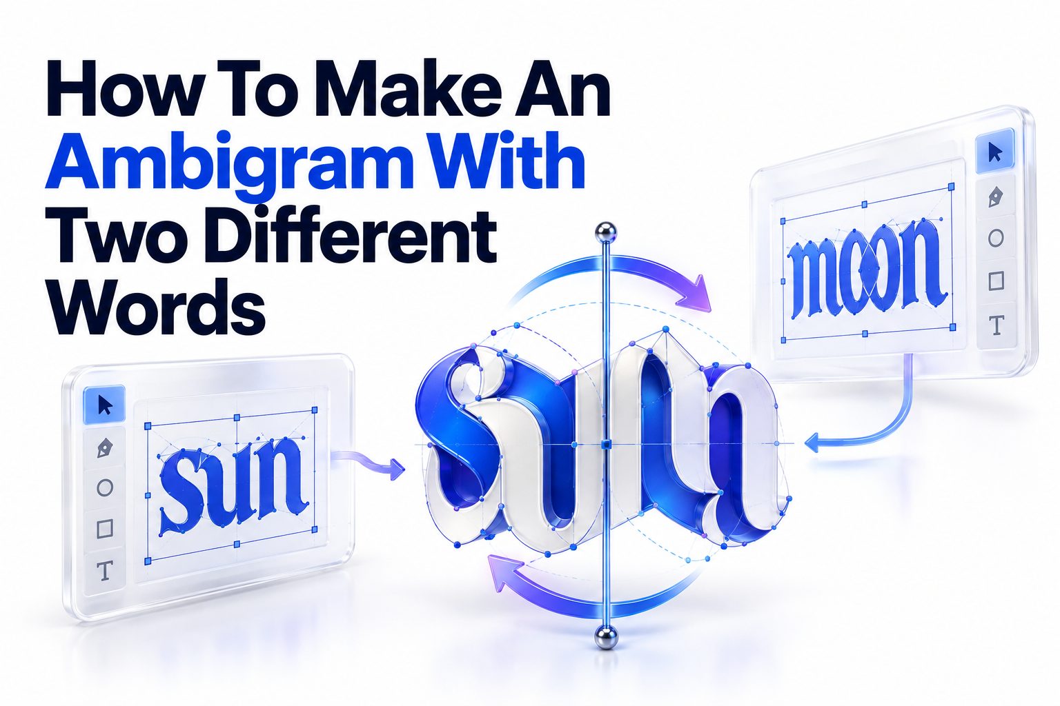
Making one word readable in two directions is already a design puzzle. Making two different words share the same lettering takes more planning, because every stroke must perform two jobs. Learning how to make an ambigram with two different words starts with choosing a workable transformation: most often, one word appears upright and the other appears after the design is rotated 180 degrees.
The process is less about finding a magical font and more about matching letter structures. You compare the two words, pair letters from opposite ends, sketch shared shapes, and gradually balance readability with visual consistency. Some word pairs cooperate immediately; others require custom ligatures, stylized letterforms, or a different type of ambigram altogether.
This article walks you through the full process, from evaluating word compatibility to drawing, refining, testing, and digitizing the finished design. You will also learn why certain combinations fail, which tools are useful, and how to improve a design without sacrificing either word. By the end, you will have a practical method you can apply to names, tattoo concepts, logos, artwork, and personal lettering projects.
What a Two-Word Ambigram Actually Is
A two-word ambigram is a single graphic that can be interpreted as two different words under a defined transformation. In the most familiar version, the first word is readable in its normal position. After the artwork is turned upside down, the second word becomes readable.
This is called a rotational ambigram, or more specifically a 180-degree rotational ambigram. Other forms use mirrors, reflections, negative space, or changes in viewing angle. Rotational designs are usually the most practical starting point because they can be tested simply by turning the paper around.
The Difference Between Ambigrams and Reversible Fonts
A reversible font contains predesigned characters intended to resemble other characters when rotated or reflected. It may help generate ideas, but it rarely solves a two-word design automatically. The letters still need to connect, align, and follow a consistent visual style.
A custom ambigram is built around the exact word pair. Its letters may not resemble standard type when viewed individually, yet they become convincing inside the full composition. This reliance on context is not a flaw; it is one of the central principles of ambigram lettering.
Common Ambigram Transformations
A rotational design changes meaning after a half-turn. A mirror ambigram reveals another reading in a reflective surface or across a vertical axis. A figure-ground ambigram uses positive and negative space to show separate words, while a perceptual shift design changes meaning without being moved.
For a first two-word project, use 180-degree rotation unless the word structures clearly favor another transformation. It is easier to sketch, evaluate, and reproduce. It also works well for names, paired concepts, monograms, tattoo lettering, and compact logo marks.
Choosing Two Words That Can Share a Design
Word selection has a major effect on difficulty. Two words with equal letter counts are generally easier because each letter in the first word can correspond to one letter in the second. Unequal lengths remain possible, but they often require combined letters, shared strokes, or decorative space.
Length is only the first consideration. Look at the overall silhouette, repeated letters, ascenders, descenders, curves, and crossbars. Words with compatible visual rhythms give you more opportunities to create forms that feel deliberate rather than distorted.
Pair Letters in Reverse Order
When creating a rotational ambigram, pair the first letter of the upright word with the last letter of the rotated word. Continue inward until all letters or letter groups have partners. This reversal happens because rotating the complete design changes both orientation and reading direction.
Suppose the words are “LOVE” and “LIFE.” The working pairs are L/E, O/F, V/I, and E/L. You are not trying to make L resemble L. You are designing a symbol that reads as L upright and E after rotation.
Judge Shapes Instead of Alphabetic Similarity
Letters do not need to sound alike or occupy the same alphabetic category. What matters is whether their strokes can be reconciled. A lowercase “n,” for example, may rotate into a convincing “u.” A curved “e” might contribute to a rotated “a” or “g.”
Serif and calligraphic styles are often more forgiving than rigid sans-serif lettering. Their terminals, flourishes, variable stroke widths, and connections can disguise transitions. Blackletter also offers useful structural ambiguity, although excessive decoration can make both readings harder to recognize.
Word-Pair Compatibility Checklist
Before drawing, check the following:
- The words have the same length or can be divided into the same number of letter groups.
- Their paired letters contain compatible curves, stems, loops, diagonals, or crossbars.
- Neither word depends on several extremely distinctive letters that resist rotation.
- The words can be written in a shared style, such as script, serif, blackletter, or decorative capitals.
- One word does not require much more horizontal space than the other.
- Repeated letters can be represented consistently in both orientations.
- Small spelling variations, abbreviations, or capitalization choices have been considered.
- The chosen transformation suits the intended use, viewing angle, and physical format.
Planning the Transformation Before Drawing
Start by writing the first word normally and the second word backward beneath it. Align their approximate centers, then connect each upright letter to its rotational partner. This simple map prevents a common mistake: designing attractive individual characters that fail to work as a complete sequence.
Mark difficult pairs early. Easy combinations can often be resolved with basic curves or vertical strokes, while difficult ones may need ligatures or neighboring letters to share information. Solving the hardest pair first can reveal whether the word combination is practical.
Create a Structural Inventory
Break each letter into basic components rather than treating it as a finished symbol. Useful components include vertical stems, bowls, arches, diagonals, counters, crossbars, loops, terminals, and dots. Then compare the available components within each paired set.
A capital “A” may contribute two diagonals and a crossbar, while its partner needs a bowl and stem. Those requirements appear incompatible in a geometric font. In a flowing script, one diagonal might become a rotated curve, and the crossbar could extend into a neighboring connection.
Choose a Consistent Lettering Style
Select a broad style before refining individual pairs. Script allows strokes to flow between letters, making it useful for names and expressive artwork. Serif lettering provides extra terminals that can serve different functions when rotated. Blackletter offers dense, modular shapes suited to complex transformations.
Avoid committing to a familiar commercial font too early. Standard letterforms impose rules that may work for one reading but obstruct the other. Instead, borrow general characteristics—stroke contrast, slant, corner treatment, or terminal shape—while constructing custom letters for the actual pair.
Building Letter-Pair Skeletons
A letter-pair skeleton is a thin-line drawing that records structure without worrying about final stroke thickness. Draw the upright letter loosely, rotate the page, and modify it until the partner becomes recognizable. Keep alternating orientations rather than perfecting only one side.
At this stage, accept imperfect typography. A successful skeleton communicates both letters with minimal explanation. Weight, decoration, and spacing can be corrected later, but a weak structural match rarely improves merely by adding ornamental strokes.
Work From the Most Restrictive Letter
In each pair, identify which character has fewer acceptable variations. A lowercase “i,” for example, may require a dot or a clear short stem. Its partner might be more flexible. Establish the restrictive letter first, then shape the flexible one around it.
Distinctive letters such as capital R, K, G, or Q often control the pair. Readers expect certain identifying features, including an R’s leg or a Q’s tail. Preserve those cues, even if less important parts of the character become unconventional.
Use Context to Complete Ambiguous Forms
Readers interpret letters through neighboring shapes and whole-word context. A form between a recognizable “c” and “t” is likely to be read as “a” when the surrounding letters create a familiar word. This allows controlled ambiguity without making the design unreadable.
Context should support the letter, not rescue an unrecognizable symbol. Retain at least one or two defining features for every character. If several adjacent letters are ambiguous, the viewer loses the pattern and begins seeing decoration instead of language.
A Practical Sketching Sequence
1. Write both words clearly and confirm their spelling, capitalization, and preferred letter case.
2. Reverse the letter order of the second word beneath the first.
3. Divide unequal words into the same number of letters or letter groups.
4. Circle the most difficult rotational pair and sketch several possible skeletons for it.
5. Turn the page after every few strokes to check the second reading.
6. Repeat the process for the remaining pairs without adding final decoration.
7. Join the pair sketches into a complete word and adjust the overall baseline.
8. Test both readings at normal viewing size before thickening any strokes.
9. Add weight, terminals, and connections while preserving the structural cues.
10. Trace or digitize the strongest version, then test it again after rotation.
Drawing and Refining the Full Ambigram
Once the skeletons work independently, assemble them into a unified composition. Keep the letters close enough to behave like one word, but leave enough space for counters and identifying strokes. Spacing that looks balanced upright may appear uneven after rotation, so evaluate both orientations.
Draw several complete versions rather than endlessly correcting the first attempt. One variation might prioritize natural handwriting, another could use compact blackletter, and a third might emphasize geometric symmetry. Comparing full compositions makes broader weaknesses easier to see.
Balance Both Readings Fairly
Many first attempts produce one excellent word and one barely readable word. This happens when the designer treats the second reading as a constraint instead of an equal outcome. A convincing ambigram should not require viewers to be told what the hidden word says.
Alternate your working orientation frequently. You can also place two copies of the sketch side by side, rotating one copy. This reveals whether one reading has weaker spacing, inconsistent stroke weight, or letters that depend too heavily on guesswork.
Add Decoration Only After Legibility
Flourishes can solve small structural problems by becoming crossbars, dots, tails, or connecting strokes after rotation. They are especially useful in script and tattoo-style ambigrams. Their purpose should be structural as well as decorative.
Too many flourishes create visual noise. If a stroke contributes to neither word, remove it and compare the result. Clean shapes usually rotate more successfully, reproduce better at small sizes, and give the viewer fewer false letter cues.
Testing Readability in Both Directions
Test the artwork with people who have not seen the two target words. Show the design upright without explanation and ask what they read. Then rotate it and repeat the test. Record their first answer instead of guiding them toward the intended interpretation.
Feedback from an unbiased viewer is more useful than feedback from someone who already knows the trick. Familiarity makes weak forms seem clearer than they are. If several people misread the same character, revise that letter pair rather than assuming the viewers looked too quickly.
Test at the Intended Size
A large drawing may contain subtle gaps and thin strokes that vanish on a tattoo stencil, social-media icon, pendant, or business card. Reduce the artwork to its expected final dimensions and print or view it at actual size.
Also test it in solid black. Color and shading can hide structural weaknesses during design. A strong silhouette should communicate both words before gradients, outlines, texture, or dimensional effects are introduced.
Readability Test Table
Test | What to Look For | Typical Fix
Upright reading | Correct first word without prompting | Strengthen distinctive letter features
Rotated reading | Correct second word after a 180-degree turn | Rebuild weak rotational pairs
Thumbnail size | Open counters and visible separations | Remove detail and widen narrow gaps
Solid silhouette | Clear rhythm without color or shading | Simplify overlaps and control stroke weight
Quick glance | Recognition within a few seconds | Improve
Printed version | Clean edges and stable spacing | Adjust
Unfamiliar viewer | Independent identification of both words | Revise repeatedly misread characters
Tools for Making a Two-Word Ambigram
Pencil and tracing paper remain excellent tools because they encourage fast experimentation. Draw a possible form, rotate the sheet, trace it, and alter the new orientation. A light box or tablet with transparent layers makes this process faster but does not replace structural judgment.
For digital work, any vector drawing program with rotation, reflection, node editing, and layers can support the process. The key capabilities are duplicating artwork, rotating it exactly 180 degrees, editing curves, and checking a black silhouette at multiple sizes.
Working With Vector Software
Import a clear sketch, lower its opacity, and trace the main strokes with Bézier curves. Use as few anchor points as practical; crowded paths are harder to smooth. Duplicate the design regularly and rotate the copy to inspect the second reading.
Expand variable-width strokes only after the main structure is stable. Once converted to filled shapes, make optical corrections to joins, counters, and terminals. Keep an editable copy of the original paths in case later revisions require major structural changes.
Using Ambigram Generators Responsibly
Online generators can offer a quick preview, particularly for familiar letter pairs. Their results are usually based on a limited reversible alphabet, so spacing and character style may feel generic. Two unrelated words often expose those limitations more clearly than a single symmetrical word.
Use generated results as references, not unquestioned final artwork. Check every character, confirm the spelling after rotation, and redraw weak joins. For permanent uses such as tattoos or brand marks, custom refinement is especially important. For broader visual planning, [Internal Link: Custom Lettering Design Tips] can help with consistency and reproduction.
Fixing Common Ambigram Problems
When a design fails, identify whether the problem is structural, typographic, or contextual. Structural problems involve incompatible shapes. Typographic problems include inconsistent weight or spacing. Contextual problems occur when too many letters are ambiguous for the whole word to remain recognizable.
Do not redraw everything automatically. Isolate the troublesome pair, reduce it to a skeleton, and test several alternatives. A single revised terminal or shifted crossbar can sometimes improve both orientations without disturbing the rest of the composition.
Unequal Word Lengths
Different letter counts require grouping. One character in the shorter word may correspond to two characters in the longer word, or a neighboring pair may share a stem. For example, a wide “m” could potentially hold the strokes needed for two narrower rotated letters.
Grouping works best when the extra letters contain simple verticals or curves. It becomes harder when both require distinct crossbars, dots, or diagonals. Try several grouping arrangements, because matching from the ends inward is not always the only workable structure.
Dots, Crossbars, and Punctuation
Dots over “i” and “j” are common obstacles because rotation moves them to the opposite side. A dot can sometimes become punctuation, a terminal, a decorative diamond, or part of another letter. It should look intentional in both views.
Crossbars can extend across neighboring letters and serve different characters after rotation. Keep them visually connected to the correct letter in each orientation. An isolated bar that appears to float between characters will often be read as decoration or an accidental mark.
Overly Abstract Letterforms
Stylization becomes a problem when the audience must study the image for too long. Ambigrams can involve a brief moment of recognition, but they should not resemble an undecipherable symbol before the intended words are explained.
Preserve strong entry and exit cues, especially in the first and last letters. Readers use these positions to predict the rest of a word. Improving an outer letter often increases perceived readability more than polishing a central decorative form.
Ambigram Design Do and Don’t List
Do:
- Sketch the complete word early rather than perfecting isolated pairs.
- Rotate the page frequently throughout the drawing process.
- Preserve the defining feature of every difficult character.
- Test the artwork with people who do not know the intended words.
- Use consistent stroke weight, slant, contrast, and terminal treatment.
- Simplify the design before adding ornamental details.
Don’t:
- Assume equal letter counts guarantee a workable pairing.
- Force standard font characters to perform transformations they cannot support.
- Add random flourishes to disguise unreadable letters.
- Judge readability only while looking at a large, high-resolution drawing.
- let one word remain noticeably weaker than the other.
- send an untested design directly to a tattoo artist, printer, or client.
Advanced Techniques for Difficult Word Pairs
Hard combinations often improve when letters are treated as groups rather than isolated units. A stroke that appears to belong to one upright character may become part of two characters after rotation. These shared structures are called ligatures and can solve mismatched widths or letter counts.
Negative space offers another option. Instead of drawing every letter as a solid form, use gaps between thick strokes to define parts of the rotated word. This approach requires careful contrast because narrow negative spaces can close when the design is printed or reduced.
Designing From the Center Outward
The center of an ambigram is a natural anchor because it remains central after rotation. With odd-length words, the middle letter or letter group must often rotate into the middle of the second word. Solve this pivotal form before extending the composition outward.
For even-length words, the central connection may become an axis between two paired forms. Keep this junction simple. An overloaded center can make both words appear split, while a weak junction may cause the design to look like separate symbols rather than one coordinated word.
Using Case and Letter Variants Strategically
Uppercase and lowercase forms have different structures, so mixing cases may create a solution. A lowercase “r” is less complex than a capital “R,” while a script capital may offer loops unavailable in a printed lowercase character. Choose forms based on visual function.
The final word should still look intentional. Random capitalization can appear like a compromise unless the style unifies it. Adjust letter height, stroke weight, and slant so variant forms belong to the same visual system.
Knowing When to Change the Concept
Some word pairs resist a clean rotational design despite repeated attempts. Rather than forcing distorted characters, try a mirror ambigram, a stacked composition, a figure-ground treatment, or an emblem that reveals the second word through negative space.
You can also use initials, shortened names, or related terms with better structural compatibility. Changing the transformation is not a failure; it is a design decision. A clear alternative is more effective than a rotational ambigram that nobody can read.
Preparing the Finished Artwork
Clean final artwork should have smooth curves, controlled joins, open counters, and consistent spacing. Inspect it at high magnification for technical defects, then return to normal size to judge the complete form. Tiny mathematical irregularities matter less than visual balance.
Save an editable master file along with export versions suitable for the intended use. Vector formats are ideal for scaling, while high-resolution raster files may be required for specific platforms. Keep a solid one-color version even if the final design uses texture or shading.
Preparing an Ambigram for a Tattoo
Tattoo designs need enough space between strokes to remain legible as lines soften over time. Very fine gaps, tiny counters, and tightly packed flourishes may blur. Ask the tattoo artist about minimum line weight and placement-specific limitations before approving the final stencil.
Test the design on a printed outline at the planned physical size. Check it from the angles at which the tattoo will usually be seen. Body curvature can distort lettering, so placement should be considered alongside the rotational effect. [Internal Link: Tattoo Lettering Design Basics] may provide useful preparation guidance.
Preparing an Ambigram for a Logo
A logo ambigram must work quickly, not merely reward prolonged inspection. Prioritize a strong silhouette, simple shapes, and reliable reproduction at favicon or social-profile size. The second reading should support brand meaning rather than exist only as a visual trick.
Check trademark availability and originality before commercial use. Generator output and familiar reversible alphabets may resemble existing artwork. Custom construction, documented sketches, and professional legal review can reduce avoidable branding problems.
Final Production Quick Tips
- Keep separate editable, outlined, monochrome, and color versions.
- Export a rotated proof so both readings can be reviewed side by side.
- Print the design at several sizes before approving it.
- Check counters and gaps on an ordinary printer, not only a bright screen.
- Test the artwork against light and dark backgrounds.
- Ask reviewers to write what they see before revealing the intended words.
- Remove details that disappear or merge at the smallest required size.
- Confirm spelling one final time in both orientations.
Conclusion
A successful two-word ambigram comes from deliberate letter matching, repeated rotation, and honest readability testing. Begin by pairing the first letter of one word with the last letter of the other, then reduce each pair to basic strokes. Solve restrictive characters early, build thin skeletons, and postpone flourishes until both readings work.
Equal-length words are usually easier, but ligatures and shared strokes can accommodate different lengths. Script, serif, and blackletter styles provide useful flexibility, while vector software makes rotation and curve refinement more precise. No tool can replace testing, though. Show the artwork to unfamiliar viewers, reduce it to its intended size, and revise any character that is repeatedly misread.
That is the practical answer to how to make an ambigram with two different words: design for both readings from the first sketch instead of drawing one word and forcing another into it later. When every stroke has a clear role in each orientation, the finished piece feels unified, readable, and surprising without appearing strained.
Frequently Asked Questions
Can Any Two Words Form a Rotational Ambigram?
Not every pair works cleanly as a rotational ambigram. Letter structure, length, and visual rhythm create real limitations. Difficult pairs may require ligatures, mixed case, abbreviations, or a different transformation such as reflection or negative space.
Do Both Words Need the Same Number of Letters?
No, but equal letter counts make pairing simpler. Words of different lengths can use grouped letters, shared stems, or ligatures. The result must still preserve enough identifying features for each character to remain readable.
Which Lettering Style Works Best for Ambigrams?
Script, serif, and blackletter styles are often effective because their terminals, connections, and stroke variations offer flexibility. The best choice depends on the letter pair, intended mood, final size, and required level of readability.
Can an Ambigram Generator Create a Finished Design?
A generator can produce a useful starting point, but results are often generic and limited to preset letter relationships. Custom redrawing improves spacing, consistency, originality, and readability, especially for tattoos, logos, or commercial artwork.
How Long Does a Custom Ambigram Take to Design?
A simple, compatible word pair may take a few hours, while difficult combinations can require several rounds of sketching and testing. Professional designs often take longer because they include refinement, vector preparation, and reproduction checks.