
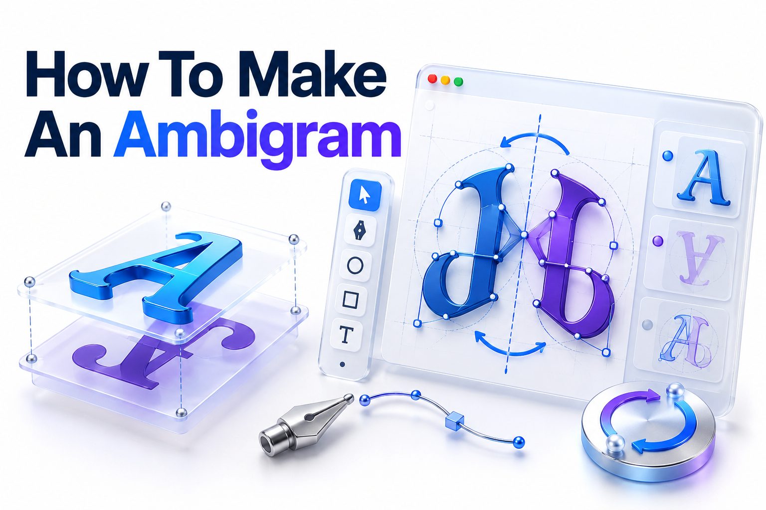
Making an ambigram starts with choosing a word, studying its letter shapes, and redrawing those letters so the design remains readable after it is rotated, reflected, or viewed from another direction. The process is part lettering, part visual puzzle. You do not need advanced drawing skills, but you do need patience and a willingness to revise individual strokes many times.
This article explains how to make an ambigram by hand, from selecting a suitable word to refining the finished artwork. You will learn how different ambigram styles work, which letters pair naturally, how to build a rotational design, and how to solve common readability problems. You will also see when software can help and why automatic generators rarely produce a polished final result on their own.
The most practical place to begin is a short word with flexible lowercase letters. Sketch it normally, rotate the page, identify strokes that can perform two jobs, and gradually combine the two readings. Treat the first attempt as a structural draft rather than finished calligraphy. Once the transformation works, you can improve its spacing, weight, symmetry, and decorative style.
What an Ambigram Is
An ambigram is a piece of lettering designed to produce a meaningful reading from more than one orientation or viewpoint. Some designs show the same word twice, while others transform into a different word. The effect depends on carefully constructed letterforms rather than a special font or optical filter.
Ambigrams often appear in logos, tattoos, book covers, illustrations, and personal artwork. Their appeal comes from the moment of recognition: shapes that initially look decorative reveal a second interpretation when the image moves, reflects, or changes direction. Strong designs balance that surprise with reasonable legibility.
Main Types of Ambigrams
The type of ambigram determines which transformations the letters must survive. A design that rotates through 180 degrees follows different rules from one reflected across a vertical axis. Choosing the format before sketching prevents you from trying to satisfy incompatible visual requirements.
Rotational Ambigrams
A rotational ambigram remains readable after being turned, usually through 180 degrees. This is the most familiar style and a practical choice for a first project. The beginning of the word becomes the end after rotation, so letters must be designed in mirrored positional pairs.
For example, the first letter must transform into the last, the second must become the second-to-last, and so on. In an odd-length word, the central letter must rotate into itself. This pairing structure is the foundation of the entire drawing.
Mirror Ambigrams
A mirror ambigram becomes readable through reflection. The reflective axis may be vertical or horizontal, depending on the intended effect. Vertical reflection swaps left and right, while horizontal reflection turns upper strokes into lower ones, creating a different set of lettering problems.
Mirror designs can work well on storefronts, printed cards, glass, and symmetrical logos. Some words are easier to reflect than rotate because their letter structures already contain vertical symmetry. Capital A, H, I, M, O, T, U, V, W, X, and Y can be useful starting points.
Figure-Ground Ambigrams
A figure-ground ambigram uses the negative space around one word to form another. Instead of transforming through movement, it asks the viewer to alternate between foreground and background. These designs require precise control of counters, gaps, and surrounding shapes.
This style is visually striking but difficult to design because every mark affects two readings simultaneously. It is better attempted after gaining confidence with conventional lettering. The principles of [Internal Link: Negative Space in Logo Design] are especially relevant when planning this kind of ambigram.
Quick comparison of common ambigram styles:
- Rotational: Read by turning the design, usually 180 degrees; best for learning the core method.
- Mirror: Read through vertical or horizontal reflection; useful for symmetrical words and display applications.
- Figure-ground: A second reading appears in the negative space; challenging but visually memorable.
- Chain: Repeated letterforms link together to create a continuous pattern; often used in borders and circular artwork.
- Perceptual shift: The image does not physically move, but the viewer interprets the same forms in two different ways.
Choosing a Word That Can Transform
Short words are generally easier because they involve fewer letter relationships. Four- to seven-letter words provide enough visual interest without creating too many constraints. Names can also work, although unusual letter combinations may demand more stylization than common words.
Avoid judging suitability from a standard typeface alone. Letters can change dramatically when handwritten, connected, compressed, or decorated. A difficult pair in block capitals may become manageable in cursive. What matters is whether the essential identifying features of both letters can share a believable structure.
Assessing Letter Pairs
Write the word forward, then write it beneath itself in reverse order. Align the first letter with the last, the second with the second-to-last, and continue toward the center. These are the pairs you must reconcile in a 180-degree rotational ambigram.
Some combinations share obvious features. A lowercase “m” may rotate into a “w,” while an “n” can suggest a “u.” Letters such as “o,” “s,” “x,” “z,” “h,” and “i” may rotate into themselves in certain styles. Other pairings require ligatures or decorative strokes.
Handling the Middle Letter
An odd-length word contains one central character that must become itself after rotation. Round or diagonally balanced letters are easiest to adapt. Letters with a strong one-sided feature, such as a lowercase “f” or “r,” can be more demanding.
The middle character does not always need to stand alone. It can borrow a stroke from a neighboring letter or become part of a central ornament. This technique provides more freedom, but shared strokes must not disrupt spacing or cause the adjacent letters to merge.
Selecting a Lettering Style
The right style makes structural compromises look intentional. Blackletter is popular for ambigrams because its dense vertical strokes, angled terminals, and ornamental flourishes can disguise transformations. Cursive offers flexible connections, while geometric lettering supports clean symmetry and simplified forms.
Choose a style that suits the word and its final use. An elaborate blackletter design may work for wall art but become muddy as a small logo. A tattoo requires clear gaps and durable line weights because fine details can soften as the skin and ink change over time.
Useful selection checklist:
□ The word contains no more than seven or eight letters for a first attempt.
□ The paired letters share at least one structural feature.
□ Any central letter can rotate into itself or join neighboring forms.
□ The chosen style permits ligatures, flourishes, or controlled distortion.
□ The design will remain recognizable at its intended size.
□ The tone of the lettering matches the word’s meaning and application.
Materials and Setup
You can design an ambigram with basic supplies: plain paper, a pencil, an eraser, tracing paper, and a dark pen. A ruler helps establish baselines, while a circular object or compass can guide arcs. Transparent tracing paper is particularly valuable because it lets you rotate and compare sketches quickly.
Digital drawing software is optional. Layers, rotation tools, guides, and vector paths make revision easier, but they do not solve the underlying letter puzzle. Begin with rough structural sketches even when the final artwork will be digital. Loose drawing encourages more experimentation than editing polished paths too early.
Preparing a Rotation Test
Draw a small arrow in one corner of the page to mark the original orientation. After each meaningful change, rotate the sheet exactly 180 degrees and inspect the result. The arrow prevents accidental 90-degree turns and helps you compare the two intended readings consistently.
Tracing paper provides an efficient alternative. Trace the draft, rotate the tracing, and place it over the original. Misaligned strokes, uneven widths, and broken letter relationships become immediately visible. This overlay method also reveals opportunities for shared stems, loops, and crossbars.
How to Make an Ambigram Step by Step
A rotational ambigram is the most practical format for learning. The goal is not to draw a normal word and add decoration around it. You are building a coordinated system in which every major stroke contributes to both orientations.
Work lightly during the first stages. Dark outlines can make an early idea feel more permanent than it is, discouraging necessary changes. Keep several variations on the page and compare them rather than repeatedly erasing a single sketch.
1. Write the word in both directions
Write the intended word normally. Beneath it, write the same letters in reverse order. If the design should transform into a different word, reverse the second word and place its letters beneath the first.
Align the characters by position. In the word “dream,” for instance, the “d” must correspond with the “m,” while the “r” corresponds with the “a.” The center “e” must work as itself. This map tells you exactly which transformations to solve.
2. Identify each letter’s essential features
Reduce every letter to the features that make it recognizable. A lowercase “e” usually needs an open counter and horizontal entry stroke. A capital “R” requires a bowl and diagonal leg. Decorative details are less important at this stage.
Ask which feature can perform another role after rotation. A bowl might become an arch, a descender might become an ascender, and a serif might become a crossbar. Mark these opportunities directly on your pairing sheet.
3. Sketch paired letters separately
Before drawing the complete word, explore each pair in isolation. Draw one letter, rotate the paper, and modify the shape until it resembles its partner. Make at least five quick variations instead of trying to perfect the first concept.
The result may initially look unusual in both orientations. That is acceptable as long as the key letter signals remain present. Ambigram lettering often occupies a middle ground between familiar characters rather than perfectly matching a conventional alphabet.
4. Connect compatible strokes
Place the most promising pairs in sequence and look for strokes that can connect. A terminal may extend into the next letter’s stem, or two bowls may share a central curve. Connections can improve both structure and rhythm.
Do not connect letters merely to hide a failed transformation. Every ligature must support the reading order. If the eye follows a flourish into the wrong character, shorten it, alter its angle, or create a clearer gap.
5. Build the full silhouette
Arrange all letter pairs along a baseline. At this stage, evaluate the word as one shape. Aim for balanced height, consistent density, and an even distribution of dark and light areas rather than perfecting small details.
Rotate the draft often. One orientation may appear stable while the other slopes, expands, or develops an awkward empty space. Adjust the overall silhouette before refining outlines. Large proportion problems become harder to correct after decorative work begins.
6. Refine spacing and stroke weight
Equal mathematical spacing rarely creates equal visual spacing. Curved letters need different gaps from straight letters, and ornamental terminals may visually fill empty areas. Squint at the drawing or view it from a distance to judge its rhythm.
Standardize the main stroke weight so both readings feel like the same lettering system. Secondary strokes may be thinner, but random changes can make one orientation look accidental. Check that counters remain open and that neighboring dark shapes do not fuse.
7. Add controlled decoration
Flourishes can help a letter perform two roles, but they should be added only after the base transformation works. Use swashes to complete missing diagonals, imply crossbars, or balance the outer edges. Keep their direction consistent with the chosen style.
Remove any ornament that attracts more attention than the word itself. The viewer should recognize lettering before studying embellishment. Decorative strokes are most effective when they appear natural in both orientations, even if their exact function changes.
8. Ink or digitize the final design
Trace the strongest sketch onto clean paper, correcting small inconsistencies as you go. Test the outline before filling large black areas. Once satisfied, ink with smooth, confident strokes and allow it to dry fully before erasing pencil marks.
For digital output, scan or photograph the drawing straight on. Rebuild it with vector paths if the artwork must scale cleanly for printing, logos, or cutting machines. Rotate the completed file 180 degrees one last time and test it at several sizes.
A compact workflow to remember:
1. Map the letter pairs.
2. Reduce each letter to essential features.
3. Solve pairs independently.
4. Assemble the full word.
5. Rotate and revise repeatedly.
6. Correct spacing and weight.
7. Add only functional decoration.
8. Test the final design in both orientations.
Improving Readability in Both Directions
An ambigram does not need to read as instantly as ordinary type, but it should become recognizable without a lengthy explanation. The strongest designs create a brief visual puzzle followed by a convincing solution. If viewers cannot identify either reading, decoration has overtaken communication.
Test the work with people who have not watched you create it. Show the design without announcing the word, then rotate it. Record which letters cause hesitation. Familiarity can make designers overlook ambiguities that are obvious to a new viewer.
Prioritize Distinctive Letter Features
Every letter has one or two high-value signals. The diagonal leg distinguishes “R” from “P,” while a crossbar helps separate “A” from an arch. Preserve those features whenever possible, even if less important portions of the character must be distorted.
Do not expect context to solve every ambiguity. Readers can tolerate one unusual letter in a clearly readable word, but several uncertain forms create too many possible interpretations. Strengthen the weakest character instead of adding detail to letters that already work.
Control Negative Space
The spaces inside and between letters contribute as much as the strokes. Counters that close up can turn an “e” into a “c” or make an “a” resemble an “o.” Uneven gaps can also split one word into misleading clusters.
Turn the design upside down and examine only the empty shapes. They should appear balanced and intentional in both orientations. This is especially important in bold blackletter and tattoo designs, where filled areas can become visually dominant.
Common Ambigram Design Mistakes
Most unsuccessful ambigrams fail because the designer commits to surface style before solving the transformation. Attractive shading cannot repair a letter that lacks its defining structure. Keep early drafts simple enough that you can redraw major strokes without losing hours of work.
A second problem is optimizing one orientation at the expense of the other. After working upright for too long, the hand naturally favors that version. Rotate the page on a schedule—after every substantial stroke change—to give both readings equal attention.
Common mistakes and practical corrections:
- Starting with a long phrase: Reduce the project to one short word or two words of similar length.
- Using a rigid font as the only reference: Draw multiple handwritten forms and test lowercase, capitals, cursive, and blackletter.
- Adding flourishes too early: Remove decoration and confirm that the basic strokes still suggest the intended letters.
- Making every letter equally strange: Keep several characters familiar so they provide context for the transformed forms.
- Ignoring the central character: Design the middle letter early because it often anchors the entire composition.
- Filling counters too tightly: Enlarge interior spaces and test the artwork at its smallest intended size.
- Trusting your own reading: Ask unfamiliar viewers what they see before telling them the answer.
- Forcing perfect geometric symmetry: Favor optical balance when exact symmetry damages legibility.
Using Ambigram Generators and Design Software
Online ambigram generators can produce a quick concept by applying a predefined lettering system to typed text. They are useful for testing word length, exploring broad styles, or seeing whether certain letter pairs might cooperate. Their output should usually be treated as a rough reference.
Automatic tools have limited control over context. A letterform that works in one pairing may collide with its neighbor in another, and generated flourishes may not suit the word’s rhythm. Custom names, two-word transformations, and professional logos normally require manual refinement.
Raster and Vector Tools
Raster applications are convenient for sketching because brushes feel natural and layers allow quick experiments. Use separate layers for guides, construction strokes, clean outlines, and fills. Rotating the canvas rather than merely rotating your view helps reveal the actual finished appearance.
Vector software is better for final production when clean scaling matters. Bézier curves let you adjust contours, repeat matching elements, and standardize stroke weight. Learning [Internal Link: Vector Lettering for Beginners] can help you convert a hand-drawn ambigram into print-ready artwork without losing its character.
Software workflow comparison:
Method | Best use | Main advantage | Main limitation
Pencil and paper | Concept development | Fast, flexible experimentation | Revisions can become messy
Tracing paper | Rotation and alignment tests | Makes structural differences visible | Limited for final production
Raster software | Digital sketching and painting | Natural brushes and easy layering | Enlarging may reduce sharpness
Vector software | Logos, prints, and cutting files | Scales without losing quality | Curves can feel stiff without practice
Online generator | Rapid inspiration | Produces an immediate starting point | Limited originality and control
Adapting an Ambigram for Tattoos and Logos
A tattoo ambigram must remain readable after the design is transferred to skin. Tiny gaps, hairline strokes, and densely packed details may blur over time. Discuss minimum size, placement, line weight, and long-term aging with an experienced tattoo artist before committing.
Print the artwork at the intended dimensions and inspect both orientations. A design that looks clear on a large screen may fail at wrist size. Also confirm spelling and rotation carefully. A polished mockup cannot compensate for an incorrect letter pairing or an unintended second reading.
Logo Requirements
A logo ambigram needs more than an interesting transformation. It must reproduce well in one color, remain recognizable at small sizes, and suit the brand’s tone. Overly ornate lettering can limit its use on icons, packaging, embroidery, or social profiles.
Prepare upright and rotated examples for stakeholders because some people will not notice the effect immediately. Test the mark in black and white before introducing color. If the silhouette depends on gradients or shadows, the underlying letter construction may not be strong enough.
Practical final-use checklist:
□ Test the design in solid black.
□ Reduce it to its smallest expected size.
□ Rotate the actual printed version, not only the screen preview.
□ Check that thin gaps will survive printing or tattooing.
□ Ask several people to identify both readings independently.
□ Confirm spelling in every orientation.
□ Save an editable master file before creating exports.
□ Obtain professional advice for permanent or commercial applications.
Advanced Techniques for More Complex Ambigrams
Once a same-word rotation works reliably, you can attempt a design that transforms one word into another. Choose words with equal letter counts at first. Pair the first letter of the first word with the last letter of the second, then continue inward.
Words with different lengths may still work through ligatures. One character can transform into two connected letters, or two compact characters can rotate into one broad form. These “one-to-many” relationships offer flexibility but increase the risk of an unreadable result.
Using Shared Strokes and Ligatures
A shared stroke belongs to multiple letters in the same orientation or performs a new role after rotation. For instance, a long stem may act as an ascender upright and a descender upside down. Shared structures can make a design feel economical and clever.
Use them selectively. When every stroke serves several competing roles, the viewer may lose the reading sequence. Clear entry and exit strokes help indicate where one character ends and the next begins, particularly in scripts with connected letters.
Building Circular and Chain Designs
Chain ambigrams repeat connected forms around a line or circle. The end links back to the beginning, creating a pattern without a fixed starting point. These designs suit borders, emblems, rings, and decorative bands.
Begin by solving one repeatable letter unit, then duplicate it around a measured path. Test the joint between repetitions as carefully as the letters themselves. A small spacing error becomes conspicuous when repeated across an entire circular composition.
Practical Exercises for Developing Skill
Ambigram design improves through short, focused exercises rather than one ambitious drawing. Start by rotating individual letters and simple pairs. Compare several writing styles, paying attention to which structural features survive and which need substitution.
Keep a page of reusable solutions, such as “m” to “w,” “n” to “u,” or self-rotating versions of “s” and “o.” Do not treat these as fixed formulas. Each solution changes with neighboring letters, but a personal library speeds up future projects.
Try these exercises in order:
1. Draw five versions of a self-rotating lowercase “s.”
2. Create three “m” and “w” rotational pairs in different styles.
3. Build a four-letter ambigram using only simple strokes.
4. Redesign the same word in cursive and blackletter.
5. Convert a six-letter word into a balanced full composition.
6. Create two different words with the same letter count that transform into each other.
7. Test one finished design at logo size and revise the smallest details.
Conclusion
A successful ambigram grows from careful letter pairing, frequent rotation tests, and steady refinement. Begin with a short word, map its outside letters toward the center, and identify the features each character must preserve. Solve difficult pairs separately before combining them into a complete composition.
When learning how to make an ambigram, prioritize readable structure over elaborate decoration. Consistent stroke weight, balanced spacing, and open negative spaces will do more for the result than extra flourishes. Rotate the page throughout the process, test the design at its intended size, and ask other people to identify the word without prompting.
Generators and design software can accelerate experimentation, but the strongest results still depend on human judgment. Use digital tools to rotate, trace, align, and polish a concept after the underlying transformation works. Your first draft may look awkward, and that is normal. Treat each revision as a solution to a specific lettering problem. With repeated practice, you will develop a library of letter relationships and a sharper sense of which compromises remain readable from both directions.
Frequently Asked Questions
Can Any Word Become an Ambigram?
Most words can be adapted, but some require substantial distortion or complex ligatures. Short words with compatible letter pairs are easier. A technically possible design is not always sufficiently readable, balanced, or attractive for practical use.
What Is the Easiest Ambigram Style?
A 180-degree rotational ambigram is usually the easiest style to learn. Its letter-pairing logic is straightforward, and you can test every change simply by turning the page upside down without needing mirrors or specialized equipment.
Do Ambigrams Have to Read the Same Word?
No. An ambigram may display the same word in both orientations or transform into a different word. Two-word designs are easier when both words have the same number of letters and compatible character structures.
Can I Make an Ambigram Without Drawing Skills?
Yes. Basic sketching is enough for early structural work. Tracing paper, lettering references, and digital curve tools can improve accuracy. Patience and repeated testing matter more than realistic drawing ability because the task centers on shape relationships.
Are Online Ambigram Generators Accurate?
They can create usable starting points, but results vary in readability and originality. Generators rely on preset letterforms and may handle unusual names poorly. Review every character, spacing choice, and rotated reading before using generated artwork permanently.